This is a guest blog post from online tech retailer Newegg.
The transition to e-commerce from crowdfunding is a tricky one to navigate, and without proper attention to the right details, your carefully-crafted product could go unnoticed. At Newegg, we’ve launched thousands of new items, reaching over 32 million customers. In working with these entrepreneurs, we’ve learned where to put in the extra effort to make a new product shine above the rest. In this post, we will share what we’ve learned about appealing to online shoppers to drive home sales and create a lasting brand image.
Own your product listing
The first step to success is taking action to ensure that your online product listings accurately reflect your brand identity.
Especially as an entrepreneur new to e-commerce, your brand image is everything. Chances are, your product is a new solution to the market and customers are not familiar with what your company stands for, or the need your invention serves. To build trust with customers and convert interest into sales, you need to have a solid pitch.
Modern shoppers want to find exactly what they are searching for, learn all the details about it and be able to visualize the product working in their lives before even considering the “buy” button. This means you have a short timeframe to capture their interest, answer their questions and convince them to purchase your goods all without ever making personal contact.
Display some eye candy
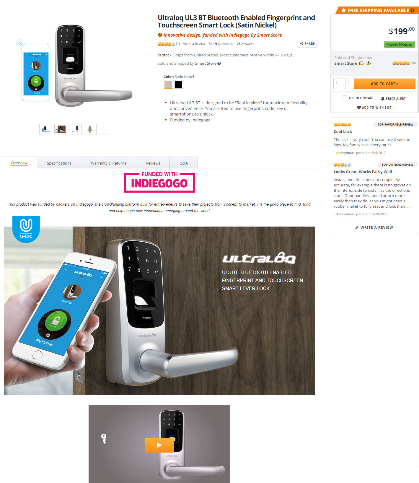
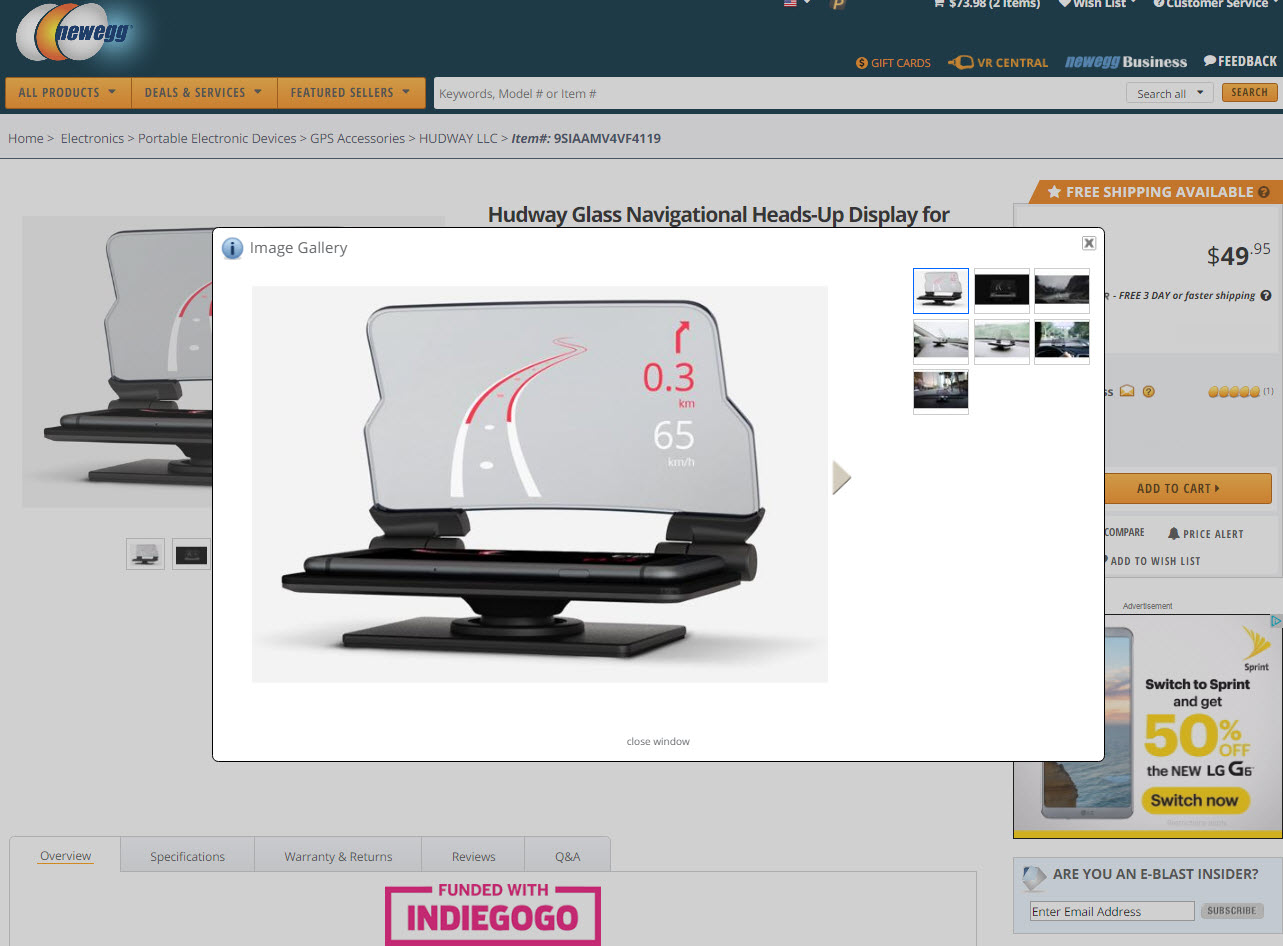
The quickest way to snag customers’ attention is to showcase some sweet eye candy in the form of high resolution images and video, like Ultraloq did on their product page. It is no longer a luxury but a necessity to have large, well-photographed, clear product images to engage customers. Here at Newegg, we recommend images that are 1560 x 1200 pixels (no larger than 2304 x 1728), so that customers can zoom without losing picture quality, and hone in on specific areas of the product. A key tip to creating engaging product photos is to have multiple angles of the product alone, and some lifestyle photos of the product in use. This gives customers a holistic view of the product in different settings, and reduces the guesswork.

Video is rapidly becoming the most popular media for product content consumption, and successful brands are using it to their advantage. Beyond simple 360° rotation clips, a well-produced video displaying the item in action using engaging commentary and music can help improve conversion on the product page, the same way it can on your Indiegogo campaign page.
Load up on detail bullets
One of the most important and highly trafficked areas of the product page is surprisingly also one of the most neglected—the detail bullet points. This is the key piece of real estate right under the product title, and offers customers a snapshot of the benefits and specs your item offers at a glance, with the optimal amount being around five. Look at how CarVi structured their bullet points as an example.

This isn’t the area to get cute with your superlatives or storytelling. Save that for your product description. This area should be used for things like voltage, materials, capacities, power, size or other brief features that are of importance.
Optimize your overview
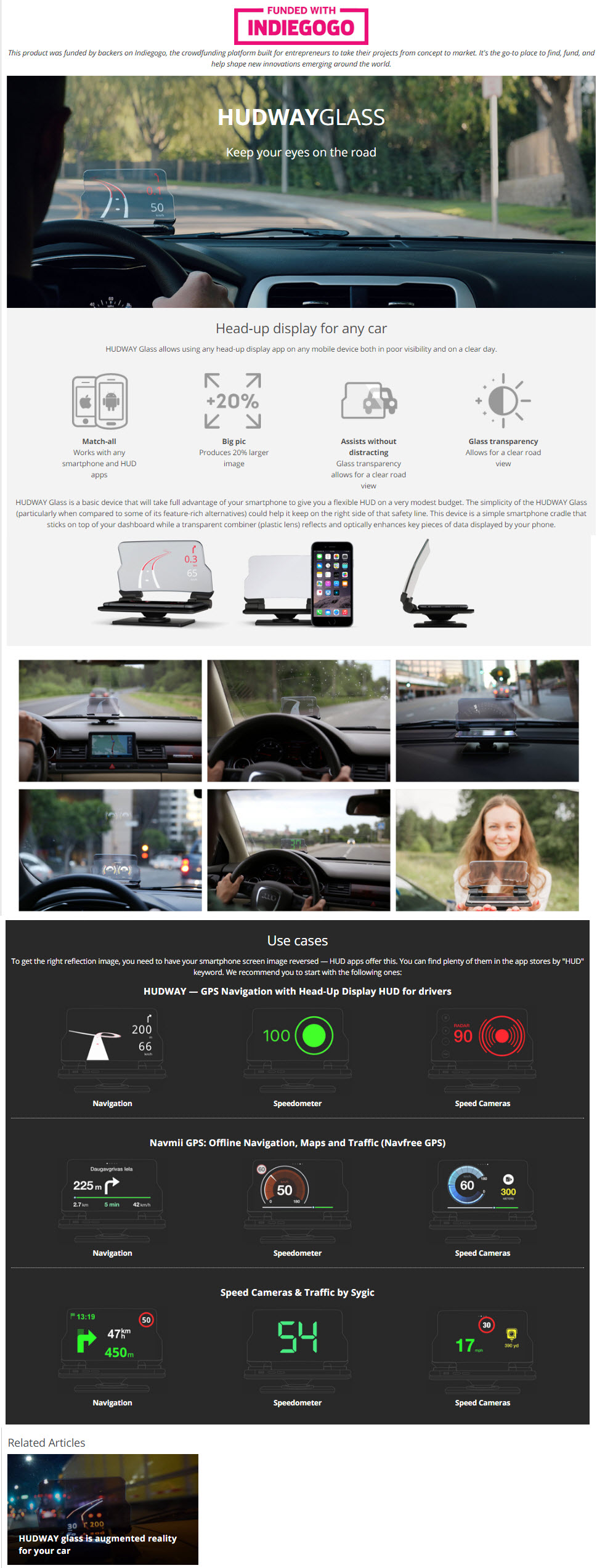
If you manage to hold a customer’s attention past the product title, imagery and bullet points you are doing well, but don’t forget the most important part! The real meat of your item listing is the product description, and it should receive special attention. Ensuring that your copy gives a full description of the product, along with use cases and relevant keywords, not only ensures visitors to the product page will get the information they are seeking, but also those browsing the web.
Peppering your description with relevant keywords helps to give an extra push for increased visibility on search engines, and focuses the use case of your product. Other important measures to take for proper Search Engine Optimization are breaking the description up into paragraphs for easier readability, and including bullet points when needed. Here is how Hudway optimized their product overview.

Put it all together
This is just the beginning of the e-commerce journey, and there are many aspects to achieving success. Thinking about your product listing from a customer’s perspective helps to guide your efforts— include the information you would want to know if you were the shopper, and be thorough when creating your content. Optimized copy, hi-res product images, rich video and thoughtful bullet points ensures your brand image will ring true across e-commerce sites and convert far more sales.

Everything you create for your brand and products should play a role in appealing to customer nature. Now that you have your content and visual branding covered, you can move on to the rest of the e-commerce equation with logistics, customer service and marketing.
Newegg is the world’s leading tech-focused marketplace, with over 32 million registered customers across the globe in over 50 countries. They offer turnkey solutions for sellers searching for fulfillment, marketing, merchandising, and e-commerce assistance to scale. Visit Newegg.com/sellers for more information or to register today.


