This guest blog post was written by Sandy Diao, a “full-stack marketer” helping to grow The ONE Smart Piano, the first piano that anyone can play.
In this post, I will be sharing optimization tips for the time that it’s easiest to freak out: campaign optimization. If you didn’t have time to complete an exhaustive list of pre-launch activities, fear not: I have been there before and these tips below will help you achieve an equal amount of success.The core topics of campaign optimization include content, on-site conversions, and measurement.
At The ONE Smart Piano, we created a piano device that can connect to your mobile device to teaches you to play with light-up keys. We prototyped the product early January to gear up for a launch on Indiegogo three months later, but we were met with unexpected delays in shipping, last minute prototyping, and filming schedules. I sweated buckets of worry since other campaigners told me that pre-launch activities could make or break the campaign, and we didn’t have time to complete most of them. I had a few people tell me to delay the campaign indefinitely.
We ended up giving ourselves another two months to finish our campaign videos. There are many reasons to delay a campaign, but I decided that extra months would throw off our schedule for the rest of the year, and that more time wouldn’t make me feel more ready. Delays are a natural part of the crowdfunding process and you should embrace them as part of the plan. Everything external from planning media hits to driving traffic to the page will be forecasts, and forecasts change.
Even if you’re feeling nervous that you didn’t put your best foot forward in the pre-launch campaign, the best thing you can do is to treat crowdfunding like another marketing project: your goal is to get backers behind your mission, and the measure of that is their confidence to fund your project. Like all other marketing activities on the Internet, it is governed by a funnel of activities that lead to you reaching your target audience. Your job is to optimize that funnel.
Content optimization
You’re sending all of this traffic to your Indiegogo page from media hits and paid advertising. Don’t waste this traffic – convert as many visitors into backers as possible. Let’s face it – there’s no way you will appeal to everyone that lands on your page, but for the visitors that count, make sure your crowdfunding landing page is compelling to them.
For The ONE Smart Piano, we had many different angles to go after. At first, we tried to make the piano the “cool” instrument so we showed the piano being used by celebrities and listed all of the pop songs you could play. While it was sexy to show the piano as the hippest new thing in town, our target audience cared more about the learning and classic features of the piano. Parents cared most about the Smart Piano being an “economical solution to piano lessons” that offered “gamified learning experiences” for their kids.
To improve your message to your target audience, do these two easy and low-cost things:
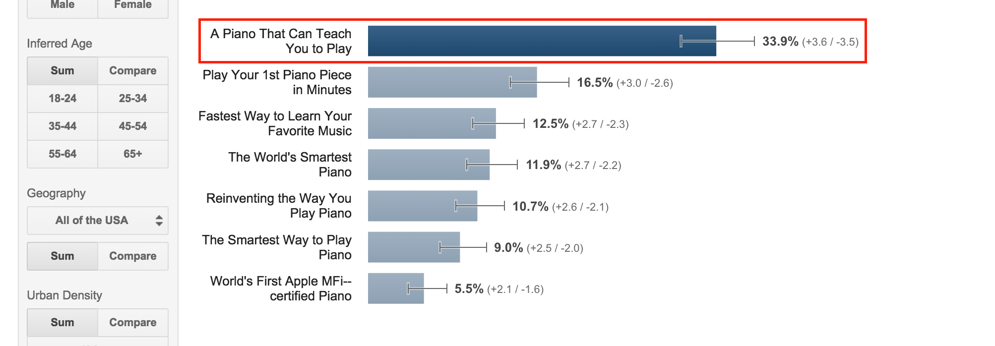
1. To figure out what your core taglines are, use Google Consumer Surveys to vet them. At 10 cents per response, you can survey 100 people for $10. You can even target specific demographics and view the results based on different audience segmentations. These responses are going to be a lot cheaper than running Facebook ads to acquire survey respondents, which is often a costly and time-consuming pre-launch activity. Use Google Consumer Surveys to gauge your mass audience messaging.
To set up the survey, come up with four to five of the strongest hypotheses you have about appropriate taglines. Above is an example of survey responses, with a result that surprised me. For mass audience messaging, it turned out that simply describing the core function was better than using provocative language.
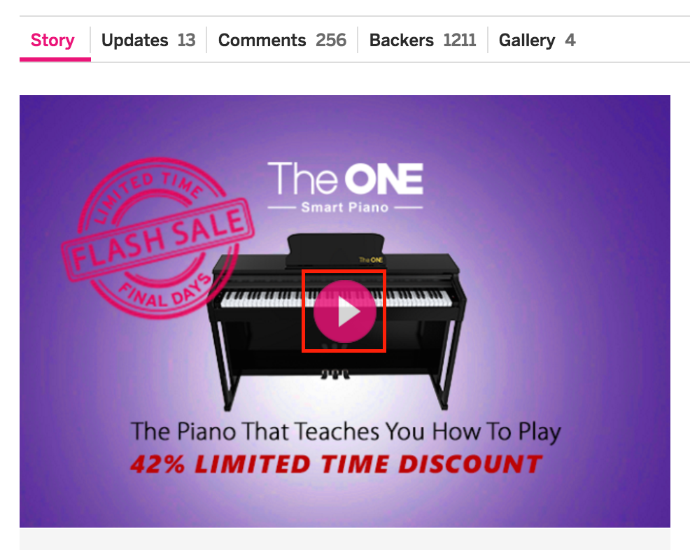
 2. A visitor’s first impression of your page determines whether s/he continues to scroll down to learn more about your product, so make sure your video thumbnail above-the-fold is a compelling image. One of the most undervalued assets on your landing page is the video thumbnail that appears above the fold. This image is not only the first image that a visitor will see on your page, but it is also the one that propagates on social shares. Create this image carefully.
I’ve outlined a few principles for this image that worked well for us:
- Add a call-to-action, whether it’s a button or a line of text at the top or bottom of the image. When your project link is shared to Facebook, people will see this image and click-through to your website.
- Use a color that can stand out and look sleek relative to other Facebook posts. A bright color, a gradient pinpoint to the center, or even a clear product shot on a white background, can draw attention to your image among the flood of posts in someone’s Facebook Newsfeed.
- Make sure your text overlay isn’t in the center of the image, because that’s where the video play icon will be.
3. You’re probably going to use a lot of GIFs and large images on your Indiegogo page, so make sure your page load time is fast. We used many long infographic-style images to showcase the Smart Piano’s design and details, which would have been a disaster for someone with a slow Internet connection. Compress your images to make sure your page isn’t bottlenecked in a visitor’s browser.
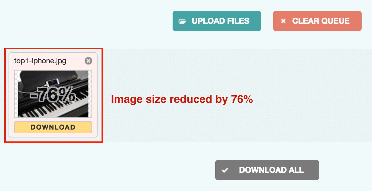
It’s simple to reduce image file sizes without reducing quality. I like to use Compress Jpeg since it’s free and I can compress images in bulk. With this tool, I can’t tell the difference even though it’s able to reduces my image sizes by a whopping 70-90%.
In the image below, I was able to compress a large 2MB image into 490K image just by using this tool.
Increasing on-site conversions
This section is focused on what you can do to get people who visit your page to convert into backers. You can find a plethora of guides on driving traffic from external sources such as paid and organic media (i.e. Facebook ads, Google ads, press hits, etc.).
You’re probably getting a lot of visitors to your page – now you need them to become your backers. Two of our most successful ways of converting backers includes providing extra communication to those with questions and making it easier for interested visitors to fund the project anywhere on the page.
1. Create a support alias or email contact so that you can provided personalized responses and increase your chances of converting backers. When we opened up an extra communication channel, people were able to ask specific questions that they wanted a personalized response to. With these answers, visitors could better understand the pros and cons of funding and they successfully became our backers. Providing personalized support via email converted visitors at a much higher rate than simply answer their questions through public comments and Q&A.
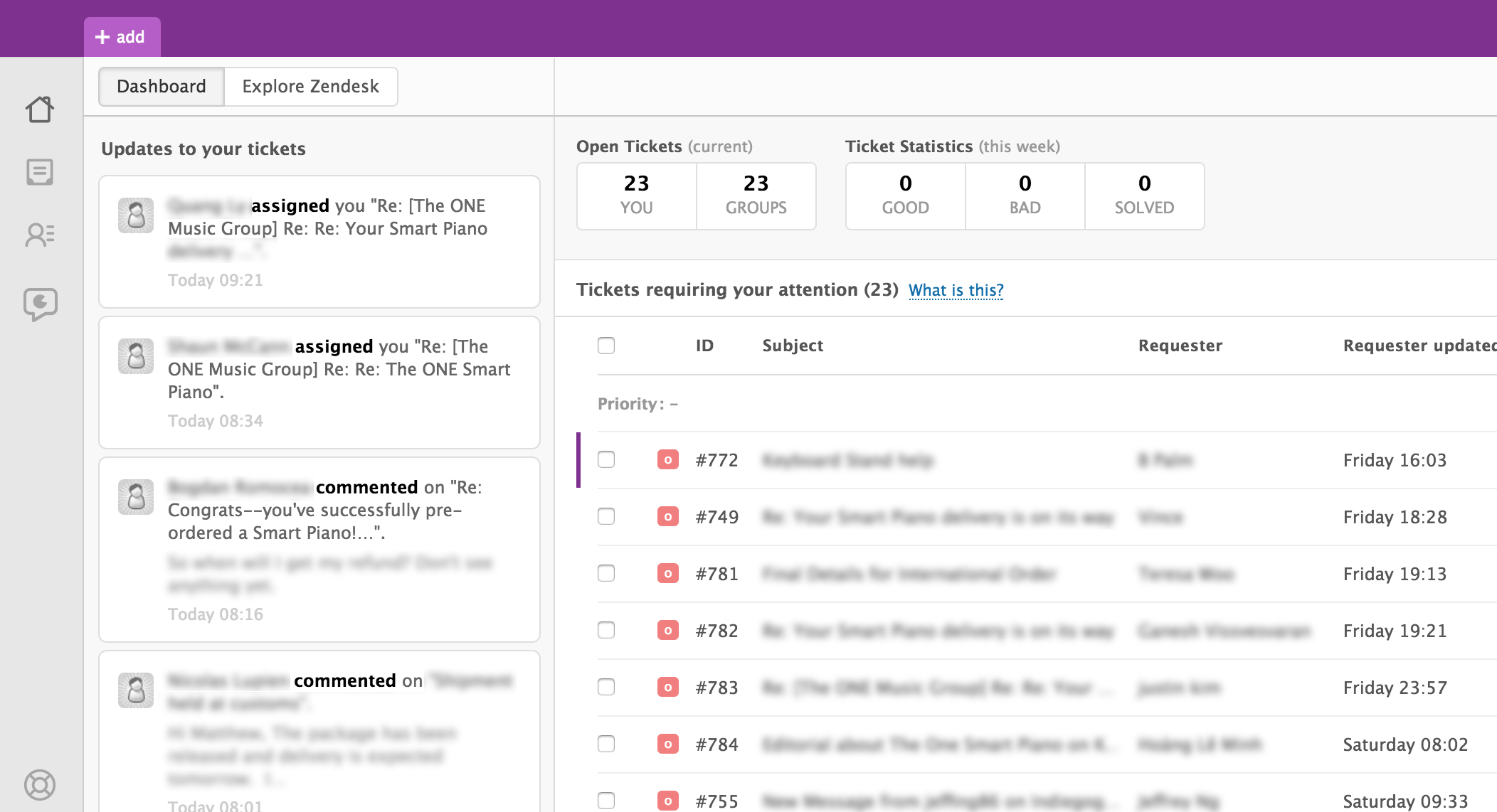
Create a free Gmail account, or create a new alias for support through your existing domain. If you’re looking for customer support interface, Zendesk has a simple interface for helping you to prioritize your inbound requests, and you can link it to your support alias. Here’s a look at how you can organize your inquiries with the Zendesk interface:
2. Add buttons and links to specific perks you reference throughout your project page, so that visitors can fund your project as soon as they’re interested. Your page can get long – it could take a visitor minutes to finish reading through everything on your project page. When you’ve got their attention, allow them to back your project from anywhere on the page, so they don’t have to scroll back to the top and potentially lose interest.
We added different types of calls to actions: Buttons and hyperlinks directly to perks. About halfway down the page, which takes a few scrolls to reach, we added links to the perks so that people who were interested didn’t have to scroll back up and look through all the perks to find the one that they just read about.
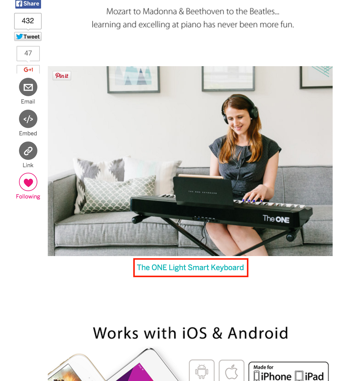
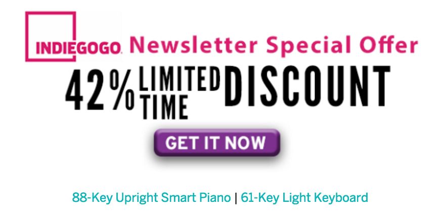
In some cases, we used images of buttons and hyperlinked them. Buttons look like they can be clicked, so they help visitors take action and fund your project. Add these hyperlinks directly to perks often, especially towards the middle and bottom of the page where it could be confusing to associate a perk they just read about with the actual perk link.
This is an example of a text-based link:
This is an example of an button link:
Measure & Optimize
You can’t just set and forget your crowdfunding page. Once you launch a specific set of changes or even receive organic media coverage, give it a few days to take effect and then measure the results.
There’s a different amount of time you’ll want to allow a campaign to run before you hastily make changes. For us, we allowed a paid campaign or press hit to run 3-4 days before looking at the final numbers. With a press hit, we often say upticks happen on Day 2 instead of Day 1, so you’ll want to wait it out a bit. The same concept applies to changes in taglines or designs – let the change run for a few days before you freak out and change everything.
Here are two ways you can change and measure effectively, without spending any money:
1. Use UTM, Bit.ly and other link trackers for your external media links to better understand what is working for you. The tools I listed here are all free to use.
We wanted to understand which type of media hits drove the most backers for our product: was it mass consumer media, technology-specific coverage, mommy blogs, or all of the above? When we shared links with press, we would append a UTM codes to our URL with the Google URL builder, or shorten links using Bit.ly to count exactly how many people clicked through from another site to our project page.
Below is an example where we linked to a piano bench we were offering and distributed the link through someone else’s email newsletter. Divide the clicks by the email list size and you have your click-through rate.
Note that the Google URL builder results can only be seen in your Google Analytics if you are linking to your own website. If you are linking to your Indiegogo page, you can use the native link tracker, which is simply igg.me/x/[your-URL] and shows up in your dashboard, or you can use Bit.ly.
2. Don’t undercut your own costs – raise your perk prices in step functions to get backers excited about funding today. For example: we started out offering a very early bird discount at $799. We eventually raised this price to $849, so we raised this by $50 without going through a smaller increment first, such as $829. That is a good amount to increase if you’ve got a product worth hundreds of dollars. This one can seem counterintuitive, but you have to remember that crowdfunding isn’t purely a sales machine. You’re trying to secure funds to carry your business forward, not so that you lose money on every transaction made.
It’s nice to offer a discount to early backers, but it comes at a cost. Don’t forget that you still have a delivery timeline to catch and you will need your contributors to help you with that. In our experience, pricing low doesn’t necessarily help backers understand your product. We wanted to showcase a premium piano offering, but we priced too low to start with. When we adjusted the price upwards to better align with our cost of goods sold, we found that backers were more excited to learn more about the premium features we were offering.
Equate your pricing with your value. Offer a good discount, but use discounted prices as a way to draw attention, and then raise that in a step function when you want to showcase the value that you will bring to contributors.
The biggest takeaway for crowdfunding is that there is no formula for success, and your product category and market fit matter more than you expect. There are some product categories that will allow you to find pockets of success easier, and some that will tough to grow an audience for right out of the gate.
There are a lot of free and low-priced solutions for measurement and optimization. You don’t necessarily need to dish out your marketing dollars for high-end solutions, because there is not fitted model of success for everyone.
Personalize everything you say, design, and price. You can reach out to your hardcore advocates or the mass market, but just make sure your message is sticky with someone. You can’t have taglines that work for everyone but make sure it reaches the people who count.
Don’t panic, don’t try to change everything on Day 2, and get some sleep so you can let the data speak. Break a leg!
Glossary of terms used:
Landing page: Your Indiegogo project page.
Above-the-fold: This is the height of your page visible in your browser, and is the first image that your page visitors will see.
On-site: Things that happens on your Indiegogo project page, versus off-site like on Facebook, Google, press hits, etc.
Ready to start your own successful crowdfunding project? Fill out this form and we’ll help you get started:
5 Responses
You must be logged in to post a comment.



Well, the time keeps moving forward!
https://www.hydromaxbathmate.com/?ko=46
This is all fine and dandy, but where is my keyboard? It should have arrived at least a month ago.
Hi everyone help please https://www.indiegogo.com/projects/greek-bailout-fund–43/x/12853987#/
Hii Everyone U may here our New Product That Specily Desigend For Pet Lover
A Unique Food Bowl – Best Pet Bowl – One of a Kind Scooper & Bowl in 1!
This new scooper and bowl combo is ideal for any size dog or cat.
You will never need another bowl! Pls Support Our #crowdfunding campaign
For The Best Pet Bowl – Launch ON Indiegogo Share our campaign with Frnd and Family
Click On Our Website https://bit.ly/1PSyZtZ
GREETING……. I must say Dr. Obasi spell really worked and I am proud to testify also. I saw a post on how a lady got her ex boyfriend back through the help of Dr. Obasi spell and I decided to try him because my marriage was crashing and my wife was asking for a divorce. Dr. Obasi helped me and my marriage is now perfect just as he promised my wife now treats me like a prince even when she had told me before he doesn’t love me anymore. well, I can not say much but if you are passing through difficulties in your relationship or marriage, contact Dr. Obasi today via obasispelltemple@gmail.com