As our campaigners can attest, running a successful crowdfunding campaign is not simply a matter of throwing up a page and waiting for money to roll in. It’s an endeavor that takes upfront planning, preparation, and effort. We humans — therefore, your potential contributors — are creatures of increasingly short attention spans, and with thousands of active campaigns on Indiegogo every day, it doesn’t hurt to get creative and go beyond creating just the standard pitch either.
While you don’t necessarily have to livestream footage of yourself on a toilet until you hit your goal (although mad props to Simon), there are plenty of other ways to stand out and engage viewers.
We’ve already given you tips to power up your pitch video, so this time we want to inspire you with examples of how some campaigners spiced up the rest of their campaign content.
1) Visualizing information
Having only long chunks of text in your pitch description is a recipe for lost interest. You don’t want to be on the other extreme either, however, and present your audience with a page of images. They’ll surely get sensory overload and run away.
A happy balance can be achieved by visualizing the information you want to communicate through charts, infographics, or even interactive maps. Make it easy for contributors to digest your information, and they’ll be more likely to do so.
Check out these great examples:
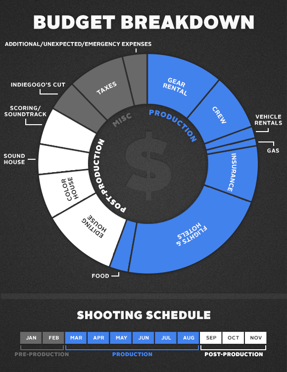
The I’m Vlogging Here team created neat infographics that conveyed the key parts of their campaign at a glance. They displayed:
- a map with the shooting locations for their documentary
- a doughnut chart that broke down where funds would be going
- a timeline with their shooting schedule
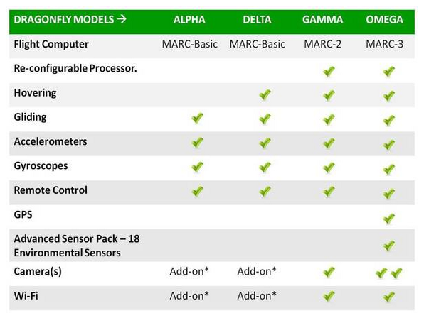
Robot Dragonfly provided a helpful table that made it much easier to compare the different models of their dragonfly drone perks.
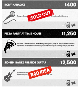
Protest the Hero had the nitty gritty details of their perks in the sidebar perk section, but then also visually laid out one-liner versions of each perk inside their pitch description. They even showed the ideas that didn’t make the final cut.
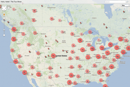
Crowdfunding and crowd-sourcing her tour, Hannah Hart of “My Drunk Kitchen” linked to an interactive map to display her travel route based on where most of her contributors were coming from.
Check out these tools for creating your own visualizations:
Visual.ly
BatchGeo
2) Incorporating moving elements
While dancing giraffe GIFs might make your campaign reminiscent of a webpage from the ’90s (hint: not recommended), we’ve seen campaigners use subtler animations effectively.
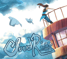
Misfit Shine and Cloudrise gently brought to life their small campaign images. The delicate movement adds a nice touch to an otherwise static page. Blink and you’ll miss it!

3) Working with the design
Campaigners have also gotten creative with their small campaign card images by tailoring them to the site’s design or using them to show new updates. These campaigners clearly looked around the site and noted the context of where each piece of their content would show up.

Whether you’re still in the drafting process or you’ve already launched your campaign, take the time to look over your content from a contributor’s point of view. Better yet, grab a friend who hasn’t seen or doesn’t know anything about your campaign to give you their honest feedback. Is the pitch easily digestible? Would they actually want to read further? What can you do to make your campaign stand out? Tap into that right brain and get creative!
Of course, the above examples are just ideas on how you can enhance your campaign. They should be additions, not substitutes, to having a well-thought-out, end-to-end strategy! Be sure to check out the rest of our insights for more tips.
10 Responses
You must be logged in to post a comment.


Indiegogo wont accept my animated gifs. It also rejects my custom html sometimes.
How do I upload video to my campaign?
We as thrivers of a coma, like my 3-month coma in 1977 at age 12, activate, demonstrate, educate, initiate, motivate, stimulate, & validate that those with cognitive challenges from either disrespectful parents in not providing proper helmet safety gear or military personnel from the wars may succeed regardless of challenges acquired. Be creative about your recovery do not settle for the vile, harmful, legal, and negative terms that are negative & restrictive, because had I, I would have never seen Europe, Mexico, MIT, etc. I would have never presented my program “Challenged Conquistadors, Inc.” at the Kappa Delta Pi International Honors Society in 1995 & never had my work or our work by SAU Professor Emeritus Ida Flemister reference my/our work to the book The Unschooled Mind written by Gardner of Harvard, at Southern Arkansas University while I was on the Students in Free Enterprise Team as a teacher recognized as valid. SAU legally denied me a teaching certificate in 1998 & claims I still owe them over $70,000 in bills from Sallie Mae. How can you borrow money for another degree after you’ve already been granted one 4-year degree by a state university? I completed a degree at University of Arkansas in Monticello in 1993, where the Challenged Conquistadors, Inc., where started in 1992.
If anyone would like to continue to promoting a positive image of those rehabilitated, then join me? Challenged means “to demand as due or deserved”; I feel after 50 plus blows to the head & 25 caused by Arkansas’s inability (illegally) to comply with the Americans with Disability’s Act of 1990 by 1994. I feel I do deserve respect for teaching in the public schools Mr. Tucker (870)864-5006, head starts Mrs. T. Smith (870)862-4545, Wal Marts Donnie (870)836-8000, Dr. Smith Community Medical Foundation for Patient Safety (832)778-7777, Dr. Atkien Arkansas Children’s Hospital (501)364-3400/1100, Dr. Poussaint Harvard Medical School (617)432-2159, etc.
Funny stuff – but those productions cost money and do not reflect what most folks can do.
any ideas to add?
If I can publish Sunsets successfully then I have other projects that I can launch. Any help will be greatly appreciated
Check out my idea – https://igg.me/at/GreenestBusTours.
So Excited!! Getting ready for my crowdfunding campaign. Launching soon!
Do U make a video of yourself or mostly text, charts & cartoon like images? Or anything you want?
I cant figure out how to add text in the story?